Why is our side bar at the bottom of the page???
I KNOW! I KNOW! let me explain this. sigh. dai oh dai. Jojo!
hahhaah ok. let's be serious.
Assumption 1:
Let's take it that Blogger displays only 10 posts each time, regardless of the length of each posts. (i'm not sure how this works, but posts could go into archives based on time frame or what.)
Assumption 2:
The side bar has a maximum length.

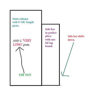
OK. Scenario one. Looking at the figure on the left, there is no problem. The total length of the ten posts do no exceed the maximum length of the side bar.

Now, Look at scenario two, which is the problem that we having now. Is that we have added two extremely long posts. But due to bloggers constrain of always diaplaying ten posts, we now have an extremely long main column! The length of the main column now exceeds that of the maximum length of the side bar.
The remainder of the total square of the main column and side bar forms an 'invisible' border.
And what happens?
The side bar is shifted down so as to compensate for the very long main column. Basically it follows as the main column expands. The thing is that the side bar doesnt expand alongside. It simply reworks the problem by shifting downwards to fill up the end.
And there we have it ladies and gentlemen! Why our sidebar has shifted to the bottom of the page! hahhah or at least so i think. because that's what happened in dreamweaver. i'm not quite sure if blogger works the same way. hhehehe. BUT! i will figure a solution out soon! YEAH! and in any case, i might just be totally, pathetically wrong! heehhehehe but i impressed you for a moment there didnt I? hahahhahha
Moral of the story? Jojo. you're not allowed to put up so big posts at one go anymore! Please break them up into smaller posts! hhehehhe. love ya!
Ain't I smart? *BEAM!*
hammy pammy big butt bob!
Btw, i did all the illustrations on Indesign! hhehe. I still don't have a digicam.


0 Comments:
Post a Comment
<< Home